
Known for its authentic Cantonese style cuisine around the world, R&G Lounge’s look & feel lacked energy and prominence. It was time for its brand to match the reputation of its food.


R&G Lounge has been serving customers since 1985. It’s reputation for authentic Cantonese cuisine was known and loved by the local Chinese community as well as people visiting San Francisco from around the world. As their customer base grew they needed a brand that connected with both the local and foregin asian community as well as tourists from every part of the globe.
Whether it be a brand strategy project or a website rebuild, I always begin by discussing current problems and current goals with my clients. R&G Lounge had two distinct customer segments and needed to be able to appeal to and connect with both. They also needed to better communicate their offerings. Beyond just the great food, they offered things like private dining and custom menu options that they felt their customers either weren’t privy to or werent educated enough about.
At the end of our discovery session we agreed that a total redo of their website was necessary - complete with a new look and feel, new copy, architecture and completely new photos.

We began the visual process by putting together stylescapes to nail down a visual direction for their brand. We came up with two very different directions (I called one trendy and the other elegant) to be sure we understood (and that they did too) what their vision was.

Professional photography is one of the most important aspects of good web design and I always ecourage my clients to invest in it. Often times it makes or breaks a great website.
We focused on two aspects of R&G Lounge for the photoshoot - the food and the space. To match the visual direction of modern and elegant, we chose to do a simplistic approach with minimal background noise for the food and wide angles to capture the expanse of R&G’s dining areas.
The food is captured mainly in closeup shots to make visitors hungry! We chose R&G’s most popular dishes so that customers will immediately recognize and connect with the experience. For the dining spaces we wanted to display the many options for private dining - one of the main offerings at R&G. It was important to show the different angles for the various rooms to show potential parties the many options at their disposal.


In every web design and build process, we begin with wireframing to work out page goals, content, layout and the customer journey before the UI design begins.
The homepage is the most visible and visited page on any website. The goal for this page is to capture the interest of visitors, steer them to your main call to action and briefly inform them of your products or services.
In my process I always give clients multiple homepage designs to choose from. All the decisions we make here will cascade down to all of the interior pages.
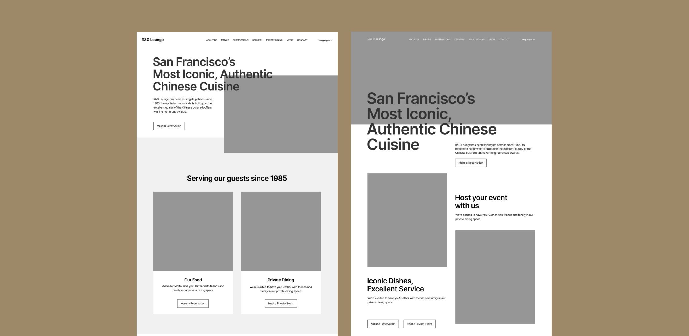
The goal throughout the entire process was to focus on the food. From the messaging to the final designs, R&G’s eclectic yet authentic dishes were front and center. We also wanted to be sure their brand was carried out through their website to give their customers a consistent experience. Little touches from the restaurant space were included on various pages to fullfill that. Consistency is key to every brand and we were able to achieve that through this touchpoint.
During the site development phase I made sure the site looked good on all devices (laptop, tablet, mobile phone, etc) and included an optional training session to educate R&G on how to update their site using Webflow’s very easy website editor. I also handled all of the techincal side of things like DNS entries, domain transfers and hosting. I set up their analytics to be able to track user behaviors, origins and any metric goals they had.


